Five Reasons to Shift Reporting from Excel to Power BI
Category: Microsoft Power BI Posted:May 07, 2020 By: Alvera Anto
Microsoft Excel has been the most preferred reporting tool for businesses, yet Power BI offers effective analytics and reporting functions for companies. With faster experimentation with visualizations, analytics, and calculations across wide datasets, and the ability to acquire solutions on the fly with the fast recombination of areas, it is clear that Power BI delivers far better insight than Excel. Let’s now look at the comparison between Power BI and Excel.
1.Gain access to and Store a Vast Amount of Data (without any Issue)
Power BI has very impressive compression abilities for Microsoft Excel as well as text/. CSV files, which allow you to check, evaluate, and envision significant quantities of data that can not be opened in Excel. The majority of computers would struggle to open up a 300 megabyte.csv, making evaluation and reporting in Excel a challenge. Adding numerous smaller.csv files to data, like sales data for bordering areas, will be extremely challenging to integrate with your previous dataset and analysis.
Can you visualize having all your data stored, linked, extensively assessed, and also using just 50mb? That’s now a fact with Microsoft’s Power BI, which makes use of powerful compression algorithms to import as well as cache the data within the PBIX documents.
Large datasets don’t have to be lowered in size and also accumulated to reveal even more encompassing analysis. All the most granular data and summarizations can exist in one file together and be accessed through drill-downs.
You also have some ability to modify and prepare your information:
- Transformations and edits consisting of altering layouts, deleting rows, including columns, and shifting data.
- Adding relationships within different tables, which serves if you have a star or snow schema.
- Including brand-new datasets easily as additional helpful information is uncovered.
New information can be incorporated on Power BI without requiring to recombine everything else all over again. This provides you with massive versatility in connecting datasets together.
With Power BI, unwanted repeating of data prep work actions is minimized or outright eliminated because the software program will bear in mind the information prep work actions and instantly duplicate them throughout data refreshes.
2. Spot data Trends Swiftly and Conveniently
Assessing trends with Power BI is exceptionally easy. With built-in time intelligence features, it only takes seconds to view substantial amounts of data. You can see data by different dimensions as well as characteristics, including date-time dimensions.
If you don’t have the data in a schema framework, you can conveniently create a date dimension table in seconds to permit the analytical functions to work. As an analytics consultant, I have personally met business executives who spend hrs every month writing Excel macros across different major files to get comparisons in the form of a time collection. These executives work through several huge Excel documents, be it with utilizing VBA or other coding methods.
Creating a time trend evaluation in Power BI
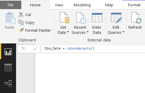
1. Firstly, the date dimension table requires to be developed. Use the “New Table” function within the Modeling bow of the Power BI Desktop, and set it as Date = calendarauto(). This develops a table with all the dates that exist for your dataset. Note that this is not feasible if you are doing a DirectQuery into your data.
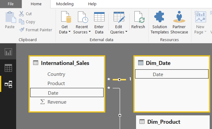
2. Next, the relationship between your data and the date table requires to be created. First, ensure your information’s date field has the proper formatting in the Inquiry Editor. In the relationships tab of Power BI on the left-hand side, drag the date areas from the date table to the date area in your data. Note that the date measurement table can be connected to multiple tables.
3. Returning to the record tab, you can now develop a visual using the date on the x-axis, and the measure(profits, for example) as the worth.
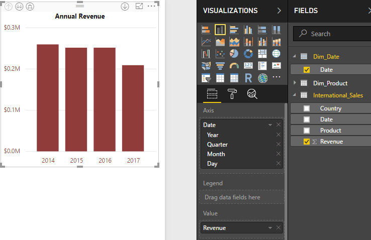
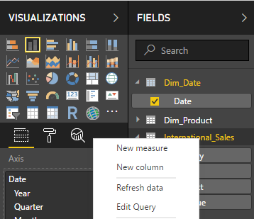
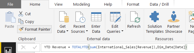
4. Additional useful measures can be developed with the time intelligence features of Power BI, as a year to date revenue. By right-clicking the table, select a new action and enter it in the layout below, the new action can now be outlined on charts like any other step. A year to date step gives a much more precise comparison of efficiency between the years: YTD_Measure = TOTALYTD( sum( Table_Name [Worth], Dim_Date [Day].
3. User-friendly UX Qualities
The beauty of Power BI is how simple it is to make something aesthetically enticing and neat with minimal creativity or UX abilities. Drag-and-drop functionality, very easy resizing, and copying and pasting make those who are familiar with the Microsoft Office suite feel right in your home.
Producing constant branding and shade schemas have never been simpler than currently with Power BI styles. An organization’s branding division can now develop a direct Power BI branding motif, in the form of a.json file, and also each expert has just to import this theme throughout growth. From there they will certainly all be creating graphs as well as graphs that are consistent with each other in regards to colouring.
A theme is simply a.json file that has the different colours in HEX layout within them and can be created or changed within a notepad file. Via the theme tab on the Home ribbon in Power BI, this.json file can be imported.
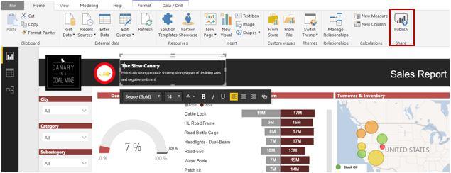
Also, Microsoft’s legendary “Style Painter” will certainly duplicate all formatting (like colour and also font style) throughout similar visualizations. The ability to make format modifications to individual visuals, like turning markers on for line graphs and modifying the placement of information labels, enables individuals to produce custom style changes to ensure that they are a lot more aesthetically appealing and also less complicated for dashboard visitors to adhere to.
4. Extraordinary Cloud-based Functions
Once you have finished creating your Power BI evaluation, you need means to publish and also share your dashboards and reports. In Excel, this would generally include emailing a big data around, placing it in a shared drive or SharePoint portal, and letting individuals understand it has been updated. Now with Power BI, this process has been completely revolutionized.
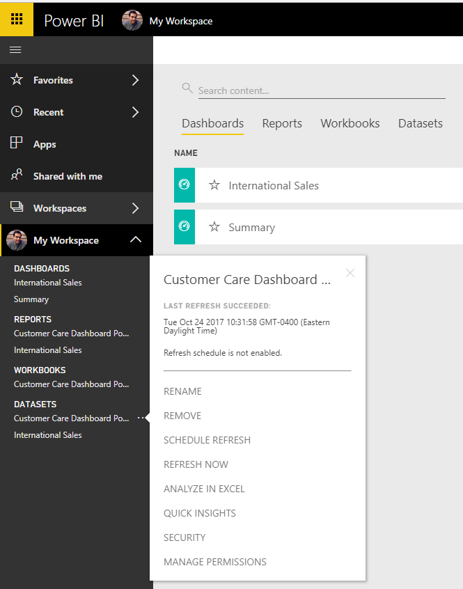
We now publish to the secure Microsoft hosted cloud solution, called Power BI Solution, and automate the refreshing of our underlying information. Hitting the publish button at the top right of the Power BI home ribbon is all that is needed.
If you require more reason to make use of the Power BI Service, besides streamlined publication and distribution, there are a handful of useful tools that are readily available once we publish to the cloud:
- Quick Insights: Powerful formulas running off the cloud can fast insights straight out of your dataset. By right-clicking your dataset on the Power BI Service and also clicking quick understandings, you can obtain a thorough analysis of your data without also having to open it in Power BI Desktop or build any type of dashboards. You will require to have a data design created, with the required partnerships if required.
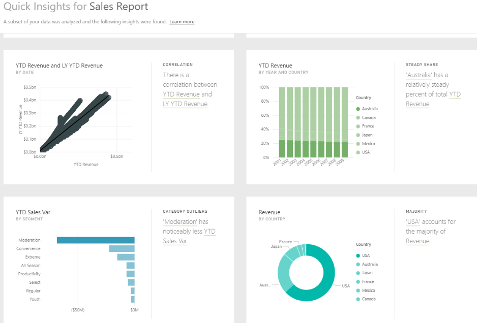
Quick Insights: Getting quick Insights into the Power BI Solution.
- Natural Language Query: This incredible attribute allows customers to type questions and obtain an answer, either in default or user-specified type. This serves for executives with particular questions and business users who are not familiar with Power BI or the data version behind the record. Additionally, this attribute conserves the record developer from having to create lots of added visualizations onto the control panel to answer every possible question. To access this, just type an inquiry right into the inquiry box on the relevant dashboard.
Natural Language Inquiry: Information visualizations that address the question gone into by the user.
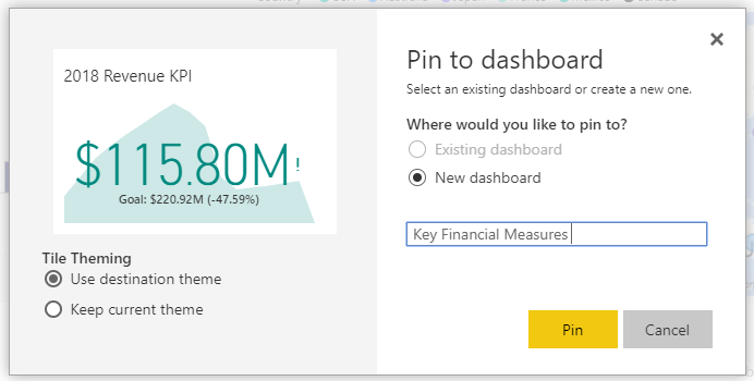
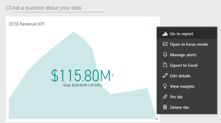
- Personalized Dashboards: Power BI users can produce dashboards that can hold private displays from numerous different reports, or whole records itself. Here, customers can customize the size and also the design of various visuals, as well as outline the control panel in such a way that it is most insightful to their details duty. Dashboards can also be produced making use of visualizations that are attached to different data sources. These recently made control panels can also be shown to various other users within the company for further collaboration. To create or relocate a visual to the dashboard, just click the pin button on the top right of a visual in a report.
Customized Dashboards: Visuals from different records can be placed into a recap dashboard
Alerts: Once a dashboard has been developed, an email notification can be established on KPIs. By right-clicking the aesthetic on the control panel and also choosing “Take care of signals”, the alternative to establish information turns up. This can be useful for employees tracking a certain action as part of a test procedure, or if supply drops below a particular quantity.
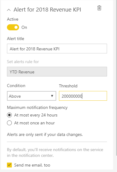
Alerts: email signals can be set up if a measure crosses a specific worth.
5. Row Level Security Features
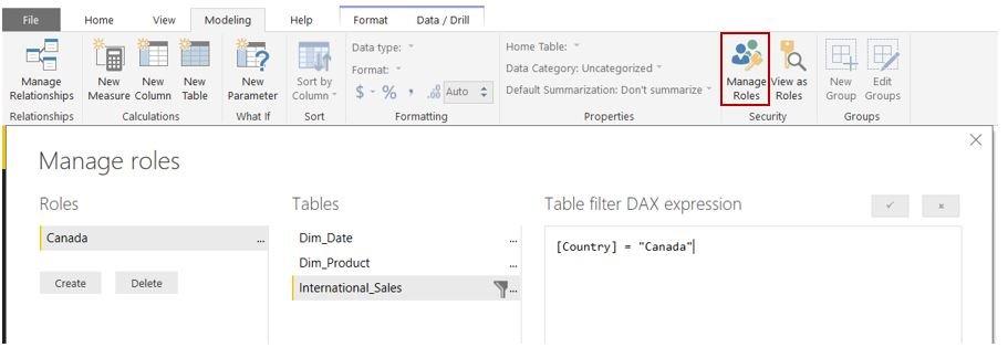
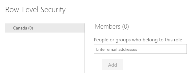
Including Row-level Security (RLS), something that was formerly complex in Excel can now be easily done for various teams by non-coders. A good example of using RLS is to guarantee that employees can just see data relevant to their regional location. Adding these accessibility filters are simple, and also the risk of others seeing information they should not from sending by mail around an Excel file is eliminated. To set up RLS, the filters for different “duties” are set up within Power BI, and the individual teams are contributed to the roles with the Power BI Solution online.
To set up RLS, select “Manage Roles” under the security tab of the Modeling ribbon. Below you can create functions for various teams, making use of DAX expression filters for different areas. For instance, the function of Canada will have the country filter set to Canada.
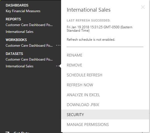
Once the record has been published to the Power BI Service, people or Workplace 365 teams can be added to various roles, though the Security option when right-clicking a dataset.
Conclusion
Power BI is an easy tool to utilize that helps propel organizations into a data-driven culture. With powerful self-service abilities, no longer business users are depending on IT for gathering, transforming, and assessing information. Automation of dataset integration, ease of expansion right into new data resources, rapid visualizations, as well as easily deployable Row-level security are among the many factors Power BI is a necessity.
Furthermore, a cloud-based relationship atmosphere with features like Natural Language Query reduces the procedure of data management. In the age of analytics, it’s important for organizations to smartly make use of the data they collect to quickly progress with evolving business as well as consumer habits.
The future is brilliant for analytics– firms are swarming to integrate data visualization, and also to do away with tabular reports with massive reams of numbers. With some quick retooling, you too can be a Power BI star for your organization! At ZaranTech, we offer online training courses on Microsoft Power BI. If you are planning to make a career in this field, do check our website for details. Join our learning community to interact with experienced mentors and to learn at your own pace without any rush. Happy learning!


 99999999 (Toll Free)
  +91 9999999